
Why blue is the colour of the moment for your home
‘True blue, baby I love you…’ sang Madonna back in 1986, but it’s easy to see why blue, with its many shades and hues, is making a big interiors splash now
‘Blue has always been a good colour for interiors,’ says Partner & Colour Designer Melanie Archer, ‘but more recently we’ve seen it evolve from a core colour into more fashionable hues with softer tones as well as inky shades.’
In the John Lewis & Partners’ Home Design Studio, they're loving their powder blue which, as Melanie explains, ‘is a hue that’s been coming through in fashion for a number of years.’ Pair with darker tones and you've got a great palette for your home. ‘Blue is also an indication of the general mood,’ says artist and colour consultant Andrea Curtis. ‘It's a colour of reflection, calm and trust.’ So how do you use blue? Melanie and Andrea share their insider secrets…
Think of it like a pair of your favourite old jeans
‘Blue has clarity,’ says Andrea, ‘as well as that sense of comfort – like your most-loved blue jeans – you just know where you are when you use it.’ But just like those blue jeans, you need to find the shade of blue that suits your home. ‘I’ve been using lots of blues for clients recently,’ adds Andrea, ‘ranging from warm inky blues through to cool powder blues. And we're not just talking accents – people are wanting to paint whole rooms with blue, not just one wall.’
Like those washed-out, well-loved jeans, blue makes a perfect base for interior schemes as Melanie explains; ‘It’s so versatile and can almost be considered a neutral, because of its simplicity. As a result, it works with most colours from classic white to more earthy terracotta.’
Use it around your home
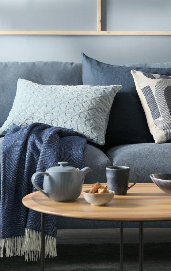
‘Using the right tone of blue can have a calming effect,’ says Melanie. ‘Soft blues can bring a feeling of peace, creating a space where we can unwind and escape what is happening in the outside world. Blue works well in most rooms, from living rooms to kitchens, bedrooms to bathrooms, although cooler tones are best avoided in rooms that already feel cold, such as north-facing ones.’
‘If you are looking to make a space feel more upbeat, then go for a stronger blue, while powder blue is one of those colours that works well in most rooms,’ agrees Andrea.
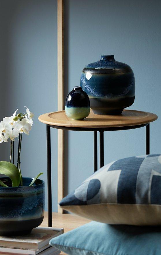
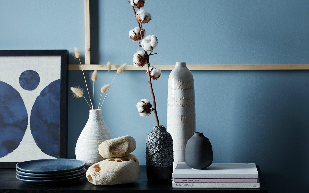
Layer in textures in different tones
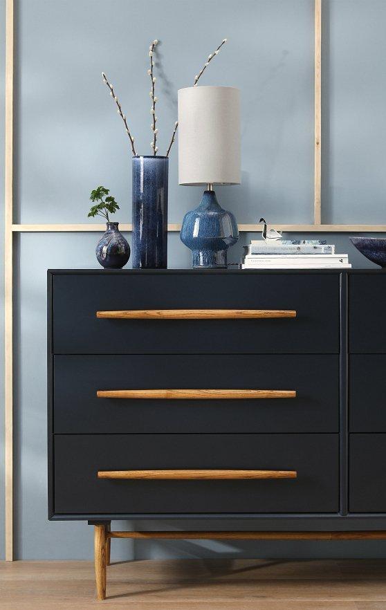
Blue can be used with any wood finish too, although it’s best to stick to similar tones to your chosen blue. ‘Try combining different powder blue textures with pale woods,’ says Melanie. ‘This will prevent the blue from being too overwhelming. Blue also pairs brilliantly with more statement finishes, such as black or brass.’
When it comes to their own homes, our two designers are both big fans of blue. ‘I have used an ink blue as a statement wall behind my bed, with a really soft blue/grey on the other walls and woodwork,’ says Melanie. ‘I’ve then used soft plaster pink as my accent for bed linen, with lots of textured throws.’
Andrea has used blue throughout her house too: ‘I love blue and green together – it's possibly my favourite colour combination.’
EDITOR'S TOP PICKS


