
5 ways to fall in love with the new neutrals

With our homes working harder than ever, it’s no wonder we’re all on the look out for moments of greater calm
Colour trends for 2021 are inviting us back into the natural world, with an earthy palette of warmer tones taking over from the cooler shades of grey we have loved so long.
The good news is that these honeyed hues are easy to decorate with and will suit most rooms but that doesn’t mean you can just splash and go. A well-considered neutral scheme builds layers of interest and uses accent colours and materials as punctuation to create a richer room scheme that’s restful to be in and easy on the eye.
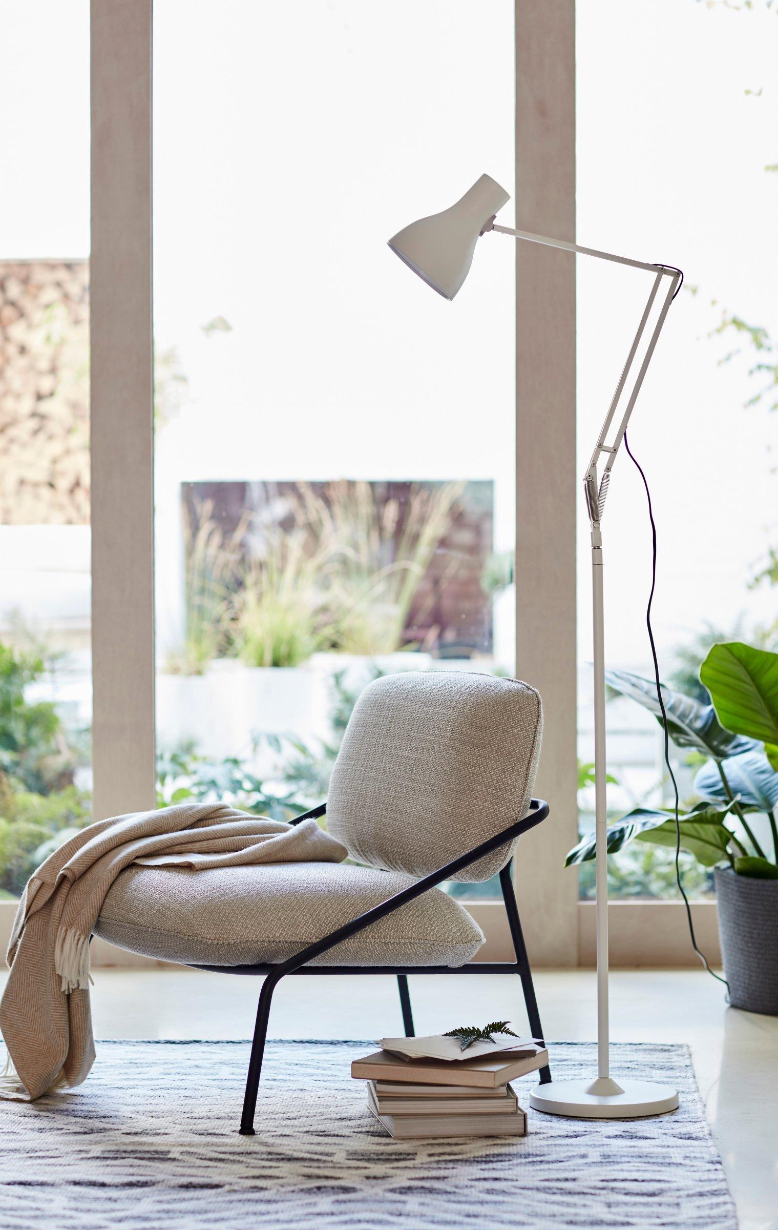
Choose a stand-out focal point
When decorating with a soft palette, be aware of over-doing the blend. Our eyes need to be able to make sense of a space and they like to find a place to rest – preferably on something to hold their attention. Some rooms will already have a great focal point such as a beautiful fireplace, but it’s also easy to create one using a stand-out piece of furniture in natural materials, with sculptural details and an organic silhouette.
‘Our Trestle table is inspired by sculpture and architecture,’ says Daniel Rawlings, Partner & Senior Designer, Home. ‘I designed it specifically for open plan spaces as the round and lozenge shaped tops are less intrusive in a room and the spindles give a sense of visual lightness.’
Make it tactile
Texture has an important role to play and has a big impact on how we feel about our home. Woven fabrics, furs, wools and velvets invite the touch but they also spark visual clues around comfort – chairs you’ll want to sink into, a throw to snuggle into.
‘Don’t forget the floor,’ advises interior stylist and author of Home For The Soul, Sara Bird. ‘It’s a huge, often undervalued expanse to use and to add interest to in a plainer, neutral room. Use different rugs such as flat weaves and tufted flooring to mark out spaces and add softness with toe-loving faux furs.’
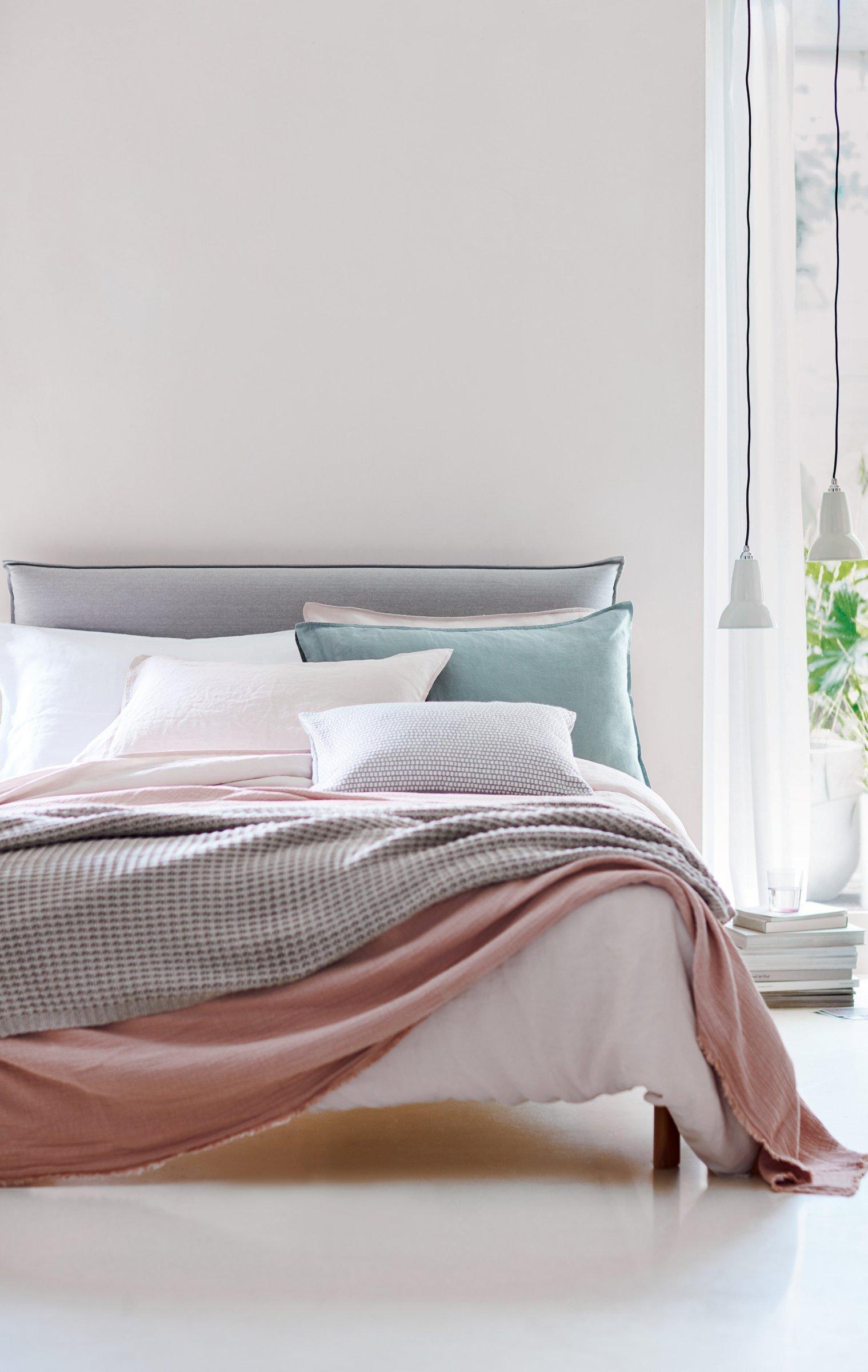
Layer up
One room when you can really pile on the comfort is the bedroom. Who doesn’t want to snuggle down in style or have cushions to prop for reading? More is more here, mixing colours as well as textures. Pale dusky pinks and watery shades of aqua make ideal bedfellows for pale linens and crisp whites and all sit within this season’s neutral palette.
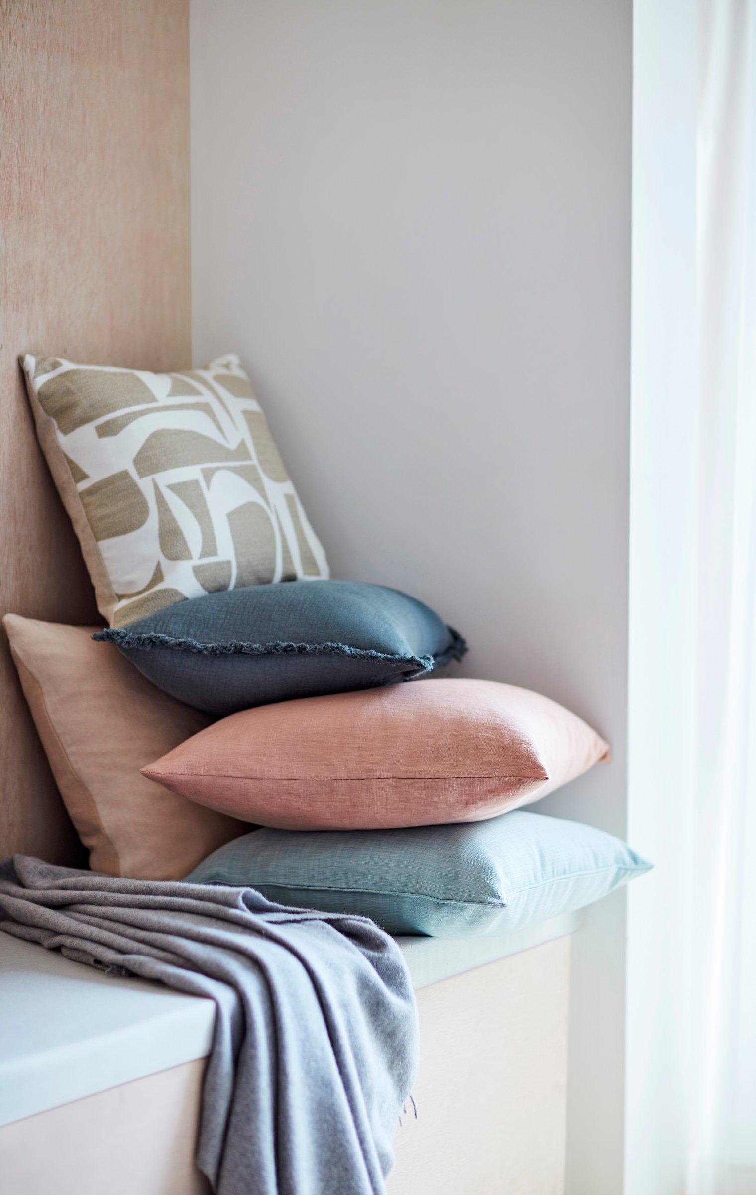
Go for chalky tones
Accent colours do more than add a bit of interest, they are the support act that allows the main shades to really sing. Colour trends for 2021 are decidedly warm and earthy with Little Greene’s capsule collection focused on shades of stone. ‘Chalky colours like plaster pink and sage are among the new neutrals and make great accents,’ says Wil Law, Home Design Stylist at John Lewis & Partners. ‘Because they are dusky and soft, they sit in harmony with shades of stone rather than creating too much contrast.’
John Lewis Woven Colour Block Cushion, Multi
£20.00£10.00
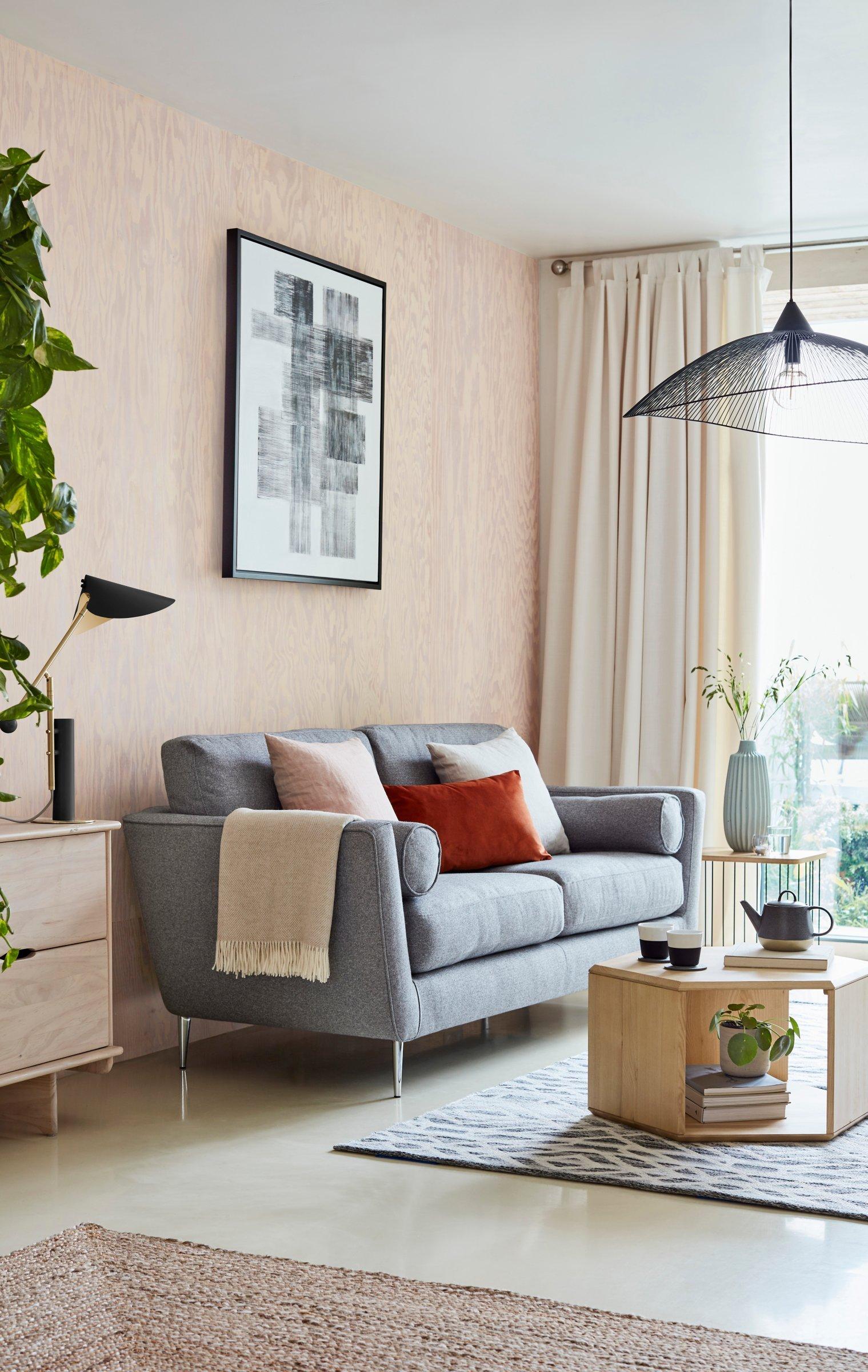
Punctuate with black
The one contrast that can be super stylish is a sleek dash of black. Think fine lines and framing rather than solid blocks. ‘Black, particularly when used as a hard finish, adds a sense of sophistication to a space and can puncture fresh and airy interiors, drawing the eye to sculptural forms in the room, such as the angle of statement lighting or the curve of a chair leg,’ adds Wil Law.


