

Master the art of contrasting prints and patterns
When it comes to bedding, there’s an art to mixing prints and patterns – not least because, of all the spaces in your home, you’re likely to want a bed that feels calming, not overstimulating.
Here’s how to match your stripes to your florals in an easy and chic way.
STEP 1
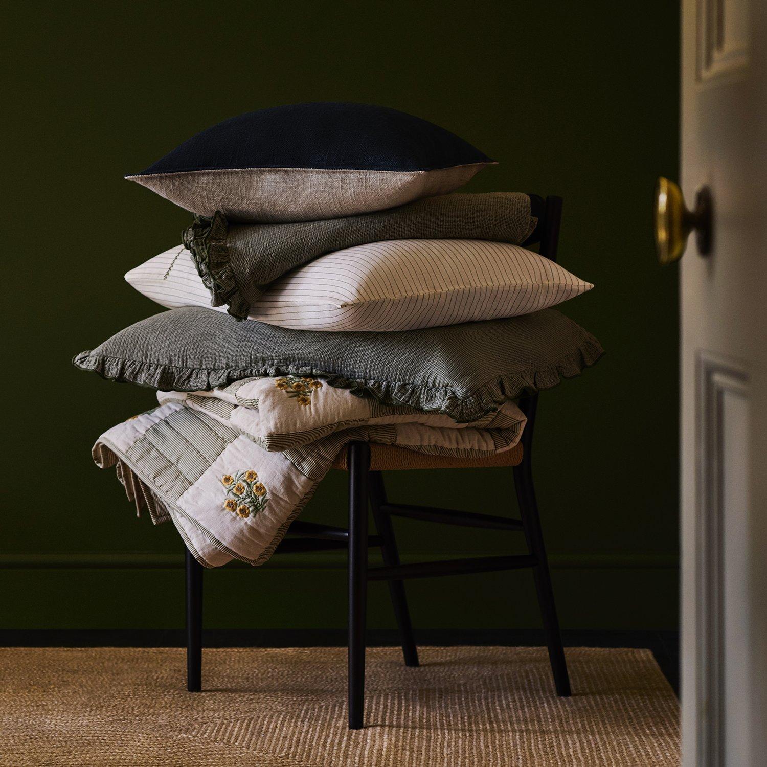
SET A SOLID FOUNDATION
Washed linen sheets are a good starting point: their natural texture creates a neutral but distinctive base from which you can add more decorative elements. Look for unobtrusive shades that are likely to mix well with others: sage, plaster, grey and almond all work well.
“Bolder prints paired with more delicate patterns create a satisfying contrast”
STEP 2
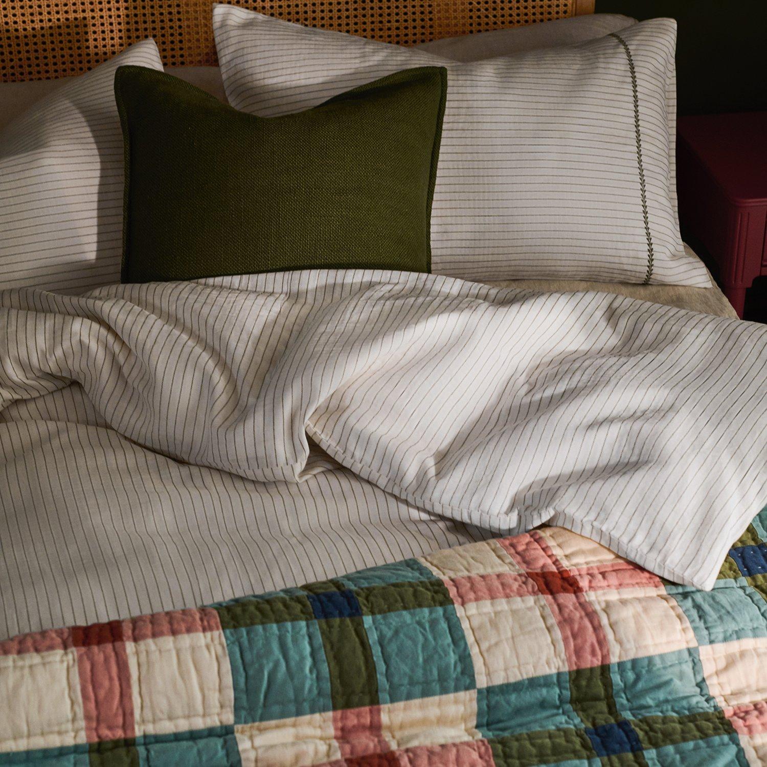
CONSIDER A COLOUR
From there, it’s about layering combinations – looking for distinct patterns that either share or complement their base colour. An avocado-green patchwork-printed quilt, for instance, could pair well with a waffle-textured duvet in the same shade, or one in blush pink, finished with a ticking stripe.
STEP 3
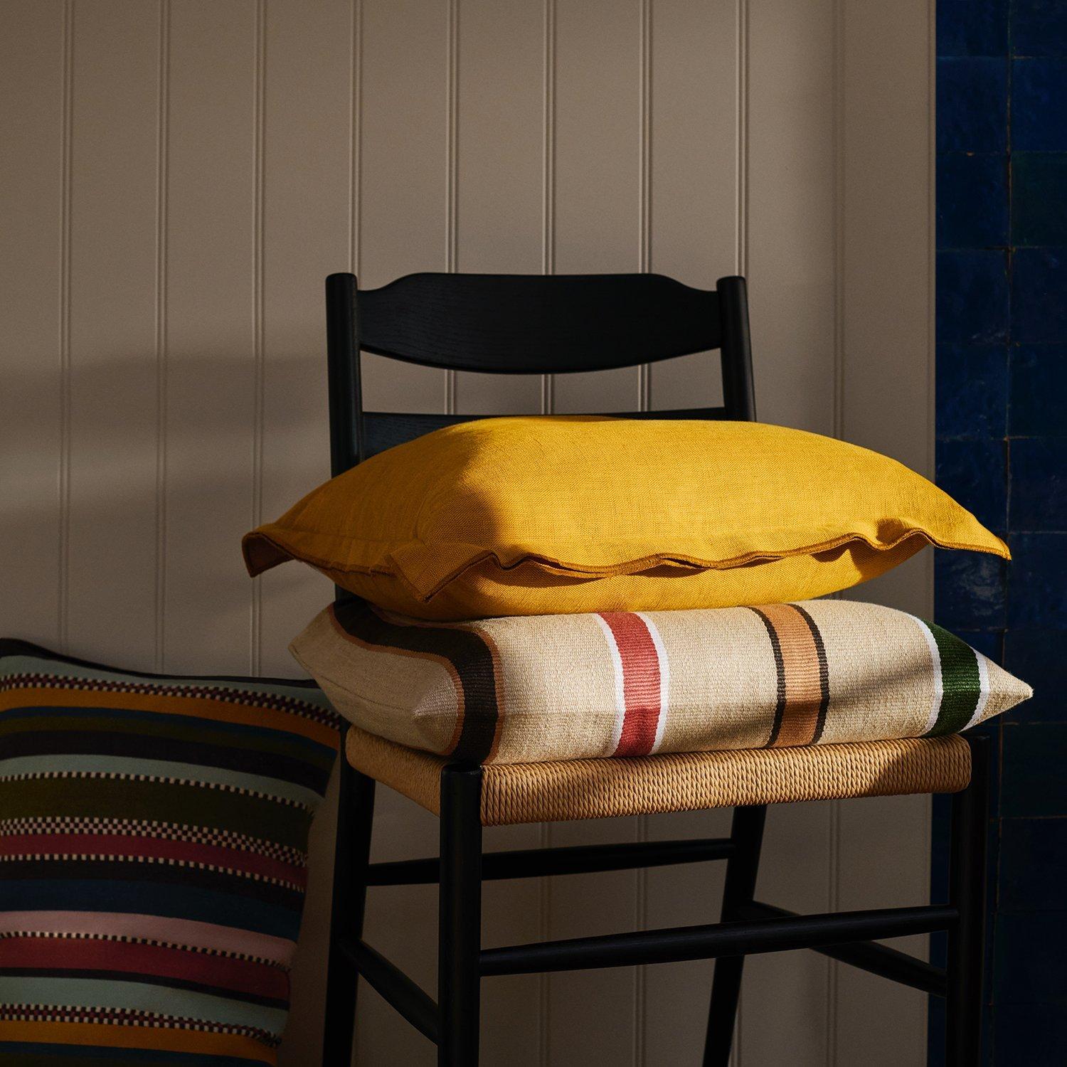
BALANCE THE SCALES
Try to vary the scale of the prints you choose: a larger floral paired with a fine stripe, for instance, and accented with textured cushions in block colours. Or mix oversized checks with more delicate patterns to create a satisfying contrast.
STEP 4
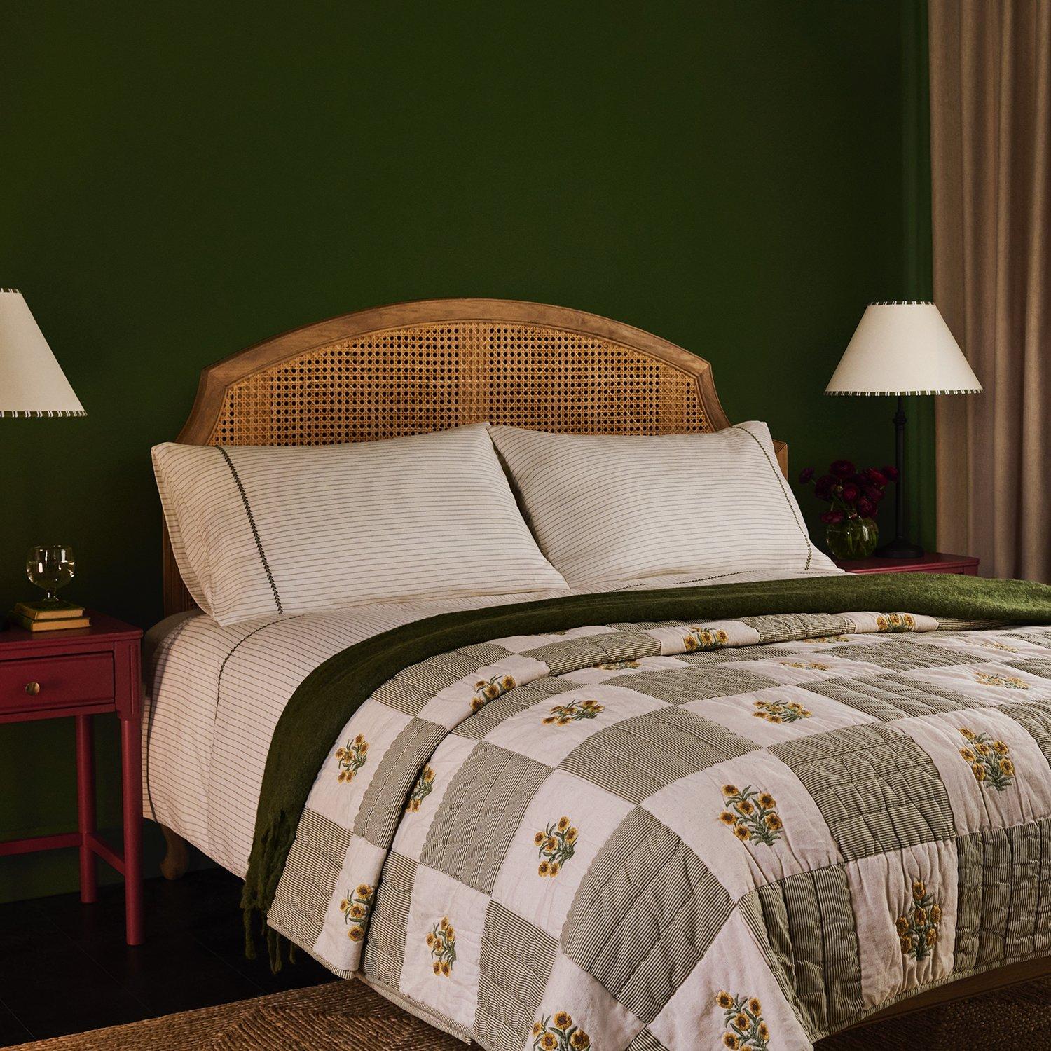
TAKE A STEP BACK
Consider how the patterns match from further back, and whether they feel evenly weighted. The most important impression, after all, is how the bed looks just as you’re planning to get into it.


